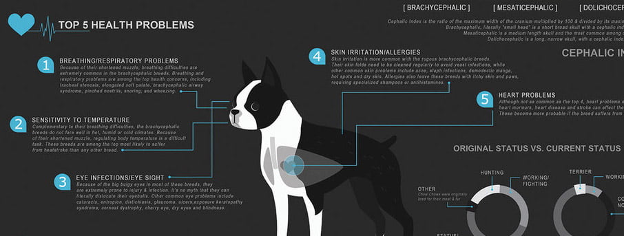
Many people in marketing these days will tell you that infographics are overused and are not as effective as they once were. This may be partially true but there is still some value in creating infographics. Bravr takes a look at some of the most valuable tips on creating the most effective marketing infographics and why.
Infographics can be a good way, if not the best way to get your message across over the internet. Studies have shown that the brain reads the data in an infographic a lot quicker than if it was contextual. Which is handy on the internet as many people today surf very quickly and are victims of skim reading content.
Apart from raising your brand identity with infographics, many SEO’s use them for marketing purposes. If a well-constructed infographic goes viral, the chances are your client website will have a sharp increase in backlinks and social signals. Which will help with increased organic traffic and referrals.
Infographics work by supplying the user with a visual display of information and data. This information is usually displayed in a manner that is relative to its subject matter. By making your infographic relevant both visually and contextually, you are increasing the likely hood that a user will be fully engaged in your infographic.
This handy blog post from neomam.com, explains how the brain is ‘visually wired’ to extract data from an infographic. Think about how your brain is wired to recognise brand identity. Within a blink of the eye, most people would easily be able to tell the difference between a Kit-kat and a Mars bar. Where as your brain would take a lot longer reading a 100 word descriptive text about each product.
When planning your infographic, think about how you want it to look. Many people opt for a vector based infographic and some to go for a highly charged piece that looks visually stunning. If you are planning on producing a vector based images, keep with a program such as Illustrator. With Illustrator you won't necessarily need to print your infographic, however, it will be able to provide you with a clean cut design.
If you are thinking of doing something a little more photorealistic, stick with Photoshop or equivalent. With Photoshop you will be able to stretch and merge imagery as well as to merge images with ease.

First things first, make sure your data is interesting and it’s something that you think the public will enjoy or learn from. There is little or no point in recycling content from another infographic as chances are its already been shared and people have got bored of it. If you have no option but to use boring information, be sure to plan carefully how your information is displayed. Don’t go over the top with graphs, give the eye some candy to keep the user's attention.
Well used colour is also a good thing to think about, a good tip is to use complimentary colours and colours you know to grab the attention of users. Standing out from the crowd is essential in today's infographic content sharing.
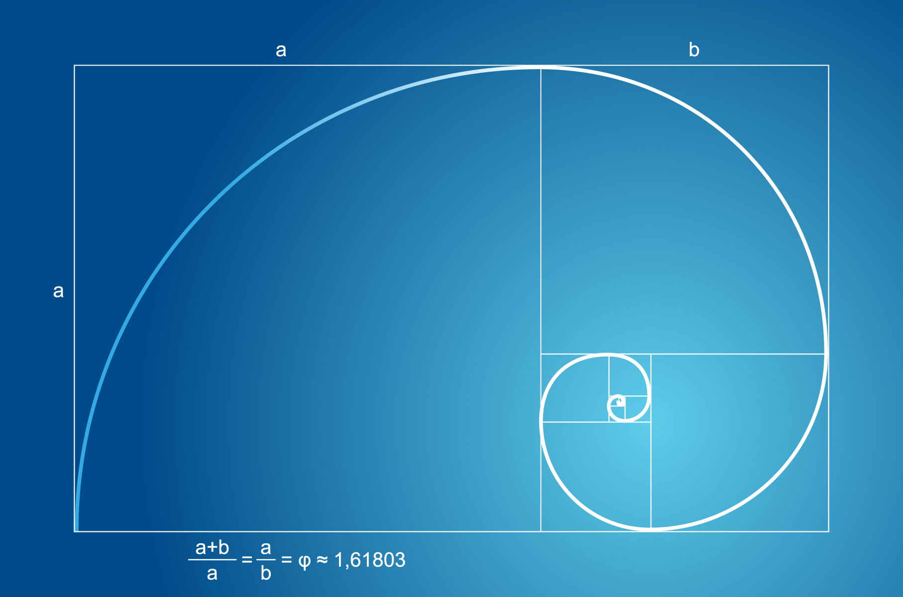
When creating your infographic, be weary of the size which you make your document. Be considerate of the websites your image may be shared upon. My recommendation would be to keep your document under 720x2000px. As this takes into consideration the average height and width of a webpage. If you are a complete newbie to the infographic world, using templates can help you on your way. One of the standard design rules with layouts is to use a guide called the golden section. Which is used my advertisers to create magazine layouts and advertising templates.

Promoting your infographic is probably the most difficult part of the whole trip, simply because of how saturated infographic submission is these days. The best things to do is to share via your social profiles, aim to get as many shares as possible, increasing impressions.
Many times I get emails from infographic creators saying ‘here's my infographic, plonk it on your website and give me a backlink’. These emails get deleted straight away, if you are planning on email marketing your emails, be sure to do it in a polite un-spammy way.
Share your infographic across art communities. Websites like Deviantart.com can be a great way to get your infographic out into the masses. Like with sharing it on social media, if your infographic is good enough, it will be shared multiple times.
We have been informed of an ongoing scam conducted through WhatsApp and other messaging platforms, falsely promising employment or payment to individuals. Please be aware that these communications are not associated with Bravr Ltd. They will attempt to direct you to a website that has a similar domain to ours with additional characters. This is a scam website and has nothing to do with us. We urge everyone to report such activities to the police and through the messaging platforms used for contact.
Please see our Fraud Prevention page for more details
Do not make any payments or disclose personal information. Official communications from our company will always come from an email address ending in @bravr.com.
Stay vigilant and safe.
Shah - Founder of Bravr Ltd.