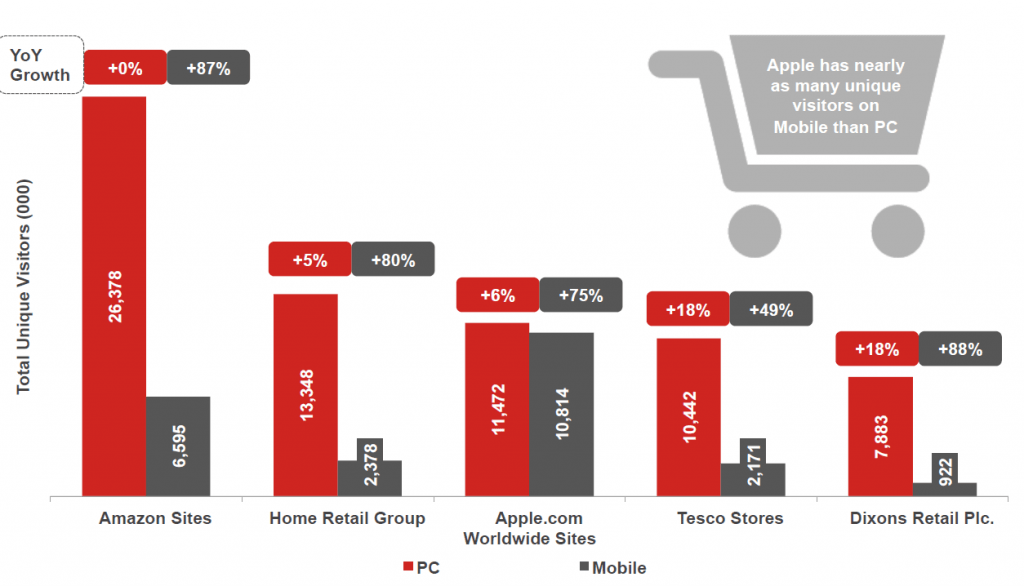
Optimising for mobile is not an option, but a necessity. The 2013 Digital Future in Focus Series by Comscore revealed that the growth rate of mobile digital commerce has outpaced PC growth rates by a considerable amount. Even Amazon, which attracts the largest share of PC users than any other major site, experienced an 87% year-on-year growth in unique mobile visitors.
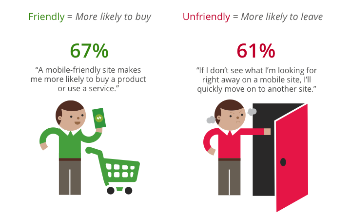
Crucially, this growing mobile audience isn’t willing to compromise their user experience. Users expect to find information quickly and easily – especially when on the go. A recent study from the Google Mobile Ads team found that 61% of people said that they’d quickly move onto another site if they did not instantly find what they were looking for on a mobile site. On the other hand, 67% of users said that they are more likely to buy from a mobile-friendly site.
By not having a mobile-friendly site, you are indirectly helping your competitors. This is not just in terms of traffic, but also reputation. The Google Mobile Ads study also found that that 50% of people will use your website less often if it is not mobile-friendly, regardless of whether they previously liked the brand.
 The research
With these aggressive growth trends, companies need to implement a multi-device plan - and the first step is research.
Analyse your audience’s goals and behaviour to gain and understanding of how they interact with your website on different platforms.
Based on this analysis, you will then need to decide on which web development option is right for your business: a fully responsive website or a separate mobile subdomain.
A mobile subdomain is allows companies to offer a completely tailored experience for mobile users. However, mobile subdomain sites are not linked to the desktop site. This mean it won’t automatically update when changes are made to the desktop version. In addition, subdomains don’t pass much link value over to the main domain. The value of any inbound link to the mobile subdomain is lost on the main domain.
Responsive design is recommended by Google and allows for immediate, flexible content delivery, regardless the device. However, it is also more costly. While you avoid the SEO issues associated with mobile subdomains, responsive sites do not allow you can’t target mobile-specific keywords as content can only be optimised once, across all devices.
The best option for your business will depend heavily on how users behave on your website which is why research is vital.
It is not worth investing in a mobile optimised site if it still offers a bad user experience – the Google Mobile Adsteam found that 52% of users said a bad mobile experience made them less likely to engage with a company.
Here are some common mobile website pitfalls to avoid:
There are a range of tools available which can help optimise your website for mobile:
Usability:
Targeting:
Testing:
At Bravr, mobile is a priority and not an afterthought, which is why we ensure it is incorporated from the very beginning of our tried and tested development process. To discover how we can make your web presence mobile–friendly, contact us.